Asymmetric typography
Arranging a page off its centre line on purpose, using alignment and white space to organise it instead of a mirror axis.
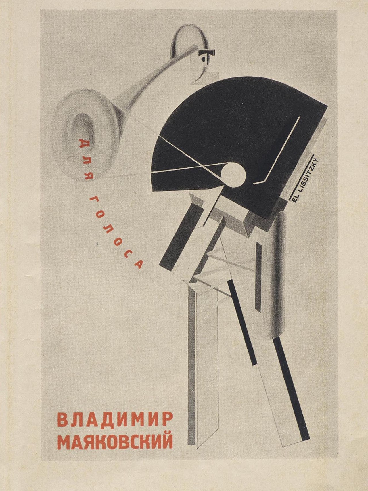
Public domain
Public domain: Printed in Berlin in 1923; Lissitzky died in 1941, more than seventy years ago, and the book is out of copyright everywhere; Commons tags the file public domain, and this house reads a faithful photograph of a flat public-domain page as carrying no new copyright; this crop is the title page.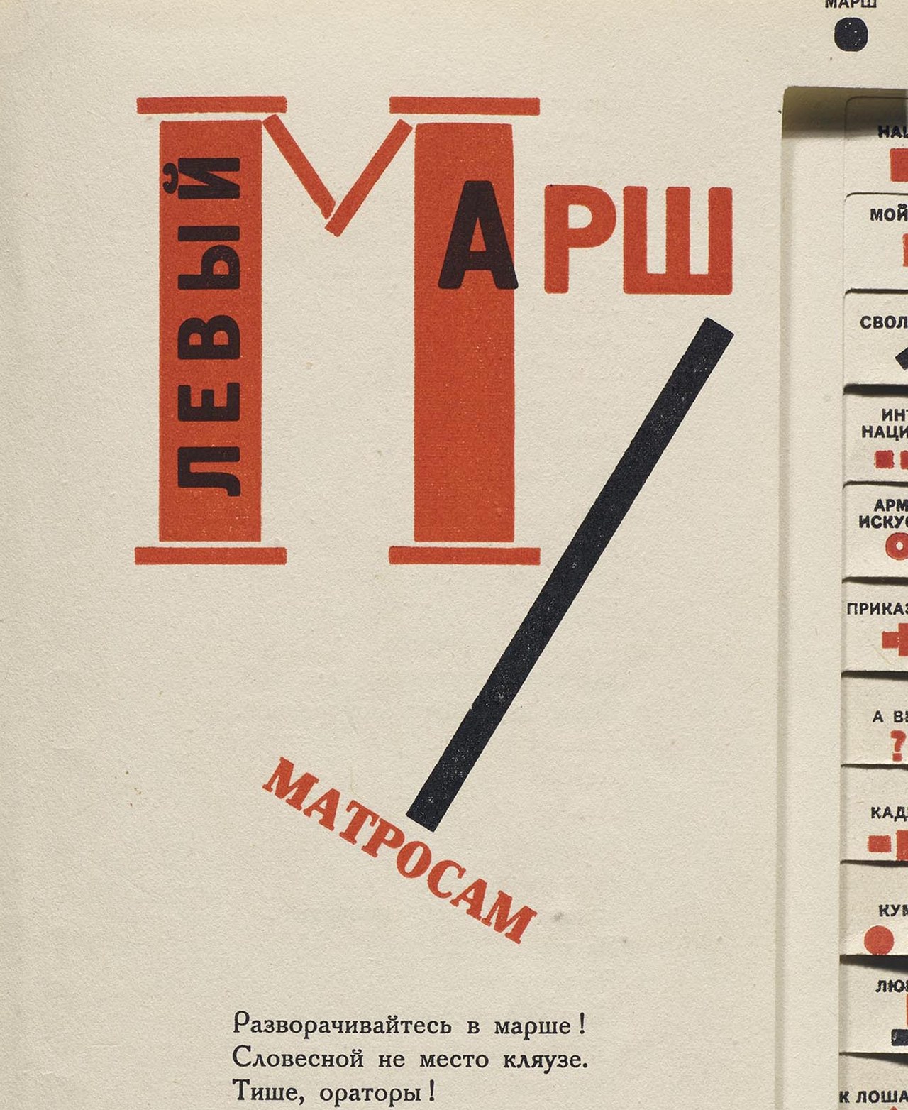
Public domain
Public domain: Printed in Berlin in 1923; Lissitzky died in 1941, more than seventy years ago, and the book is out of copyright everywhere; Commons tags the file public domain, and this house reads a faithful photograph of a flat public-domain page as carrying no new copyright; this crop is the Left March page.Near it
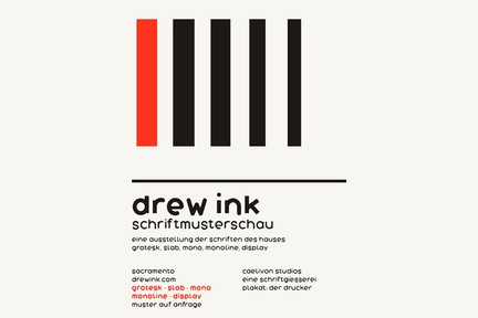 Swiss typography
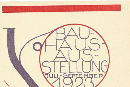 Bauhaus
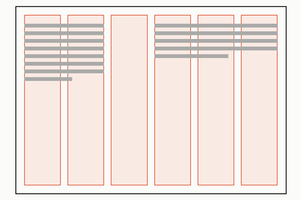 Grid
Grid

Where it came from
Argued for by Jan Tschichold in Die neue Typographie, 1928, a position he later moderated in his own practice.
Sources
- Die neue Typographie, Jan Tschichold not read