Blackletter
Also called Gothic script, Fraktur, Textura
The dense broken-stroke script of northern Europe, written with a broad nib held at a steep angle so the curves become angles.
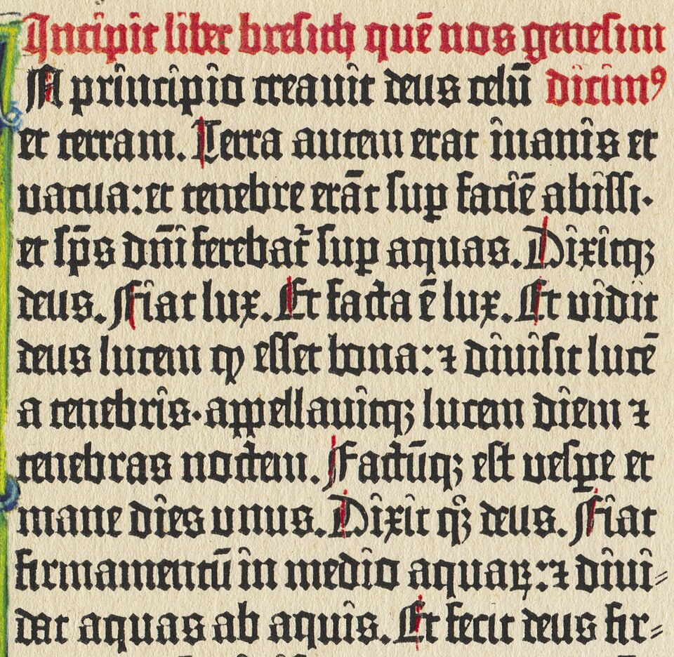
Public domain
Public domain: Printed about 1455; the printer died in 1468, and the page is out of copyright everywhere; Commons tags the file public domain, and this house reads a faithful scan of a public-domain flat page as carrying no new copyright.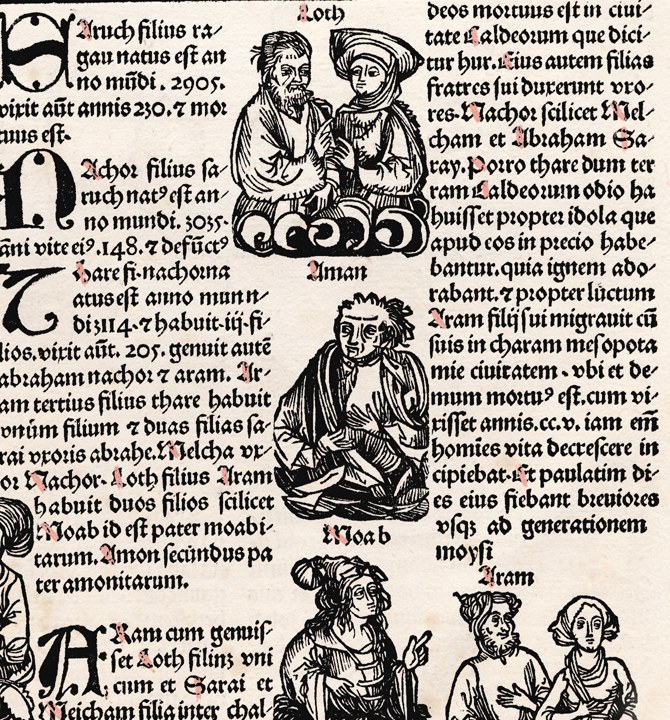
Public domain
Public domain: A leaf printed in Augsburg in 1497; out of copyright everywhere; Commons tags the file public domain, and this house reads a faithful photograph of a flat public-domain page as carrying no new copyright.Near it
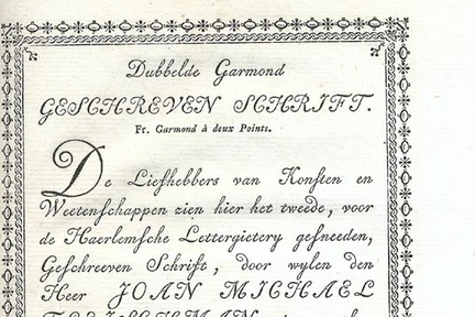 Script
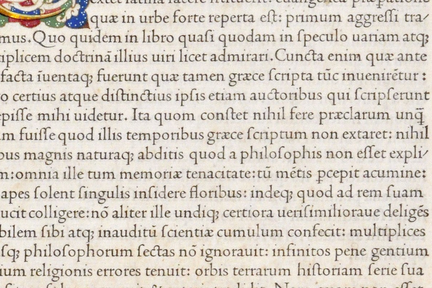 Humanist

What it is made of
| strokes | angular, and in the older hands either pointed or round; De Vinne: "In different manuscripts made before the fourteenth century one finds letters that are condensed, expanded, of light face, of dark face, with plain capitals, with flourished capitals, but all of them are of an angular style." | Theodore Low De Vinne, The Practice of Typography: Plain Printing Types (New York: The Century Co., 1900), pp. 292-294, p. 292 |
| colour on the page, and this is where the NAME comes from | De Vinne: "most of them, especially the more pointed forms, had lines so thick that more black than white appeared on the written page. The English name of black-letter was given to this character only after the introduction and general use of roman printing-types. The roman type was then called white-letter as a ready name of distinction, for roman showed more white than black upon the printed page." | Theodore Low De Vinne, The Practice of Typography: Plain Printing Types (New York: The Century Co., 1900), pp. 292-294, pp. 292-293, the quotation running across the page break. It is quoted entire because the second half is the part that makes the first measurable: the class is named for the ratio of black to white on a page, and roman is named for the same ratio the other way round |
| subclasses | De Vinne: "Out of the many styles then in fashion the early printers selected but two... One was the pointed black-letter, now known to French bibliographers as the lettre de forme. This was the standard or formal letter which was preferred for all the carefully written books. The other style, the round gothic, is known as the lettre de somme, and it was the style most approved for ordinary books." The pointed form is the one English readers kept, "so identified with early English printing that it fairly deserves its generally accepted name of Old English." | Theodore Low De Vinne, The Practice of Typography: Plain Printing Types (New York: The Century Co., 1900), pp. 292-294, pp. 293-294 |
| and this shelf has none of it | no family here is a blackletter | so the entry is the text and not our version of it, said plainly rather than illustrated with a face that is not one |
| the classification this term belongs to is retired | de-adopted 18 March 2021 | AND THE CLASSIFICATION THIS TERM BELONGS TO WAS RETIRED BY ITS OWN CUSTODIAN. The ATypI board de-adopted Vox-ATypI on 18 March 2021 and withdrew its endorsement, because the system divides only the Latin writing system and a later revision put Cyrillic, Arabic, Hebrew and the Asian scripts together under one heading called Non-Latines. ATypI, "ATypI de-adopts Vox-ATypI typeface classification system", published 27 April 2021, read whole (1,136 words). THE STATEMENT DOES NOT DEFINE THIS CLASS: it names only Garaldes and Linéales as examples, so nothing in this entry's own definition comes from it |
Where it came from
The letter of Gutenberg's Bible, around 1455, and the standard book hand in German-speaking Europe until the twentieth century.
Sources
- The Practice of Typography: Plain Printing Types, Theodore Low De Vinne
The English name of black-letter was given to this character only after the introduction and general use of roman printing-types. The roman type was then called white-letter as a ready name of distinction, for roman showed more white than black upon the printed page.