Claymorphism
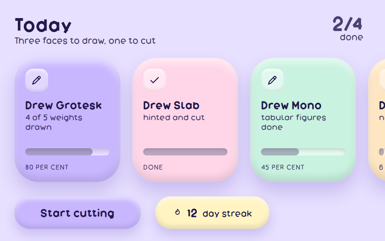
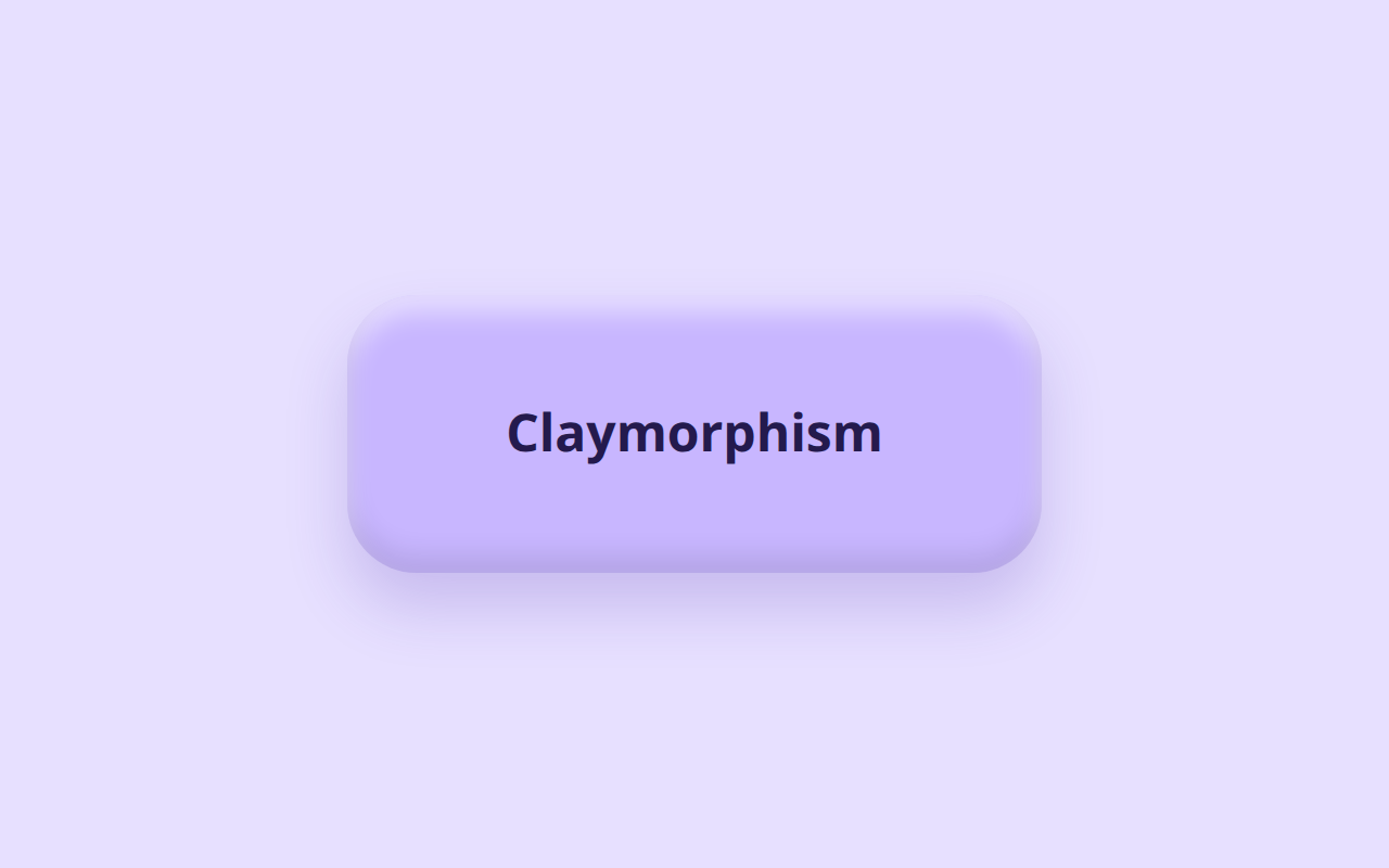
Soft inflated shapes in pastel colour, rounded far past the point of looking like a panel, as if the interface were moulded rather than drawn.
Near it
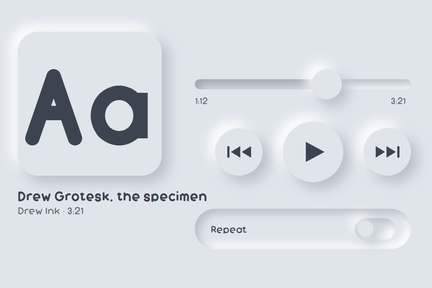 Neumorphism
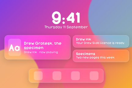 Glassmorphism
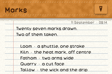 Skeuomorphism
What it looks like
Claymorphism
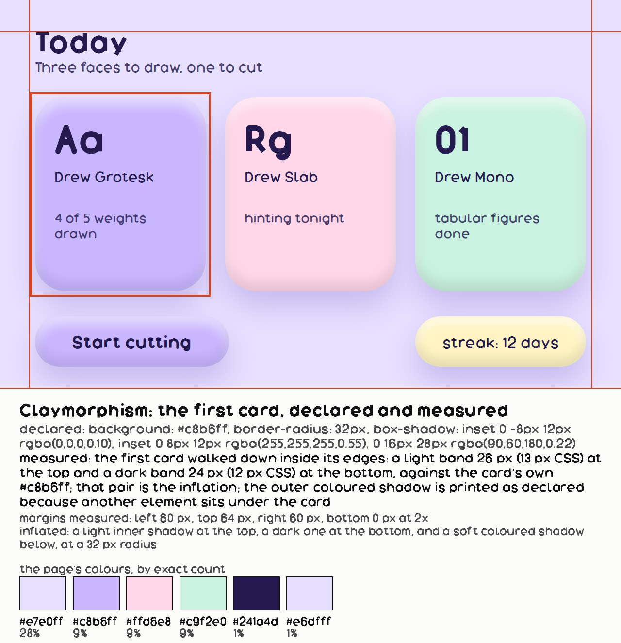
background: #c8b6ff;
border-radius: 32px;
box-shadow: inset 0 -8px 12px rgba(0,0,0,0.10), inset 0 8px 12px rgba(255,255,255,0.55), 0 16px 28px rgba(90,60,180,0.22);
color: #241a4d;
What it is made of
| radius | very large relative to the box, 24px and up | Malewicz: "if you simply inflated your neumorphic shapes. Instead of mostly flat surfaces with a little concave, they are now 3d dome-like structures — very round, very three-dimensional and soft." Michal Malewicz, "Claymorphism in user interfaces". Read whole, 1,658 words, 2026-09-11 |
| two inner shadows | a dark one at the bottom and a light one at the top | Malewicz, who named the style: "The whole effect is achieved using two inner shadows that give it that clay-like, 3d look. The top-left inner shadow has to be slightly lighter, while the bottom-right inner shadow has to be a little bit darker." OUR SPECIMEN AGREES ON LIGHT-OVER-DARK AND DIVERGES ON THE AXIS: his are top-LEFT and bottom-RIGHT, a diagonal; ours are 0 8px and 0 -8px, purely vertical. Recorded rather than quietly corrected, because the entry's page is built from this row and changing it changes the page. Michal Malewicz, "Claymorphism in user interfaces". Read whole, 1,658 words, 2026-09-11 |
| one outer shadow | large, soft, coloured rather than grey | Malewicz: "the depth against the background is only done using one larger shadow — often also moved along the X axis a little which breaks most of the conventional UI shadow rules." Ours is 0 16px 28px, one shadow and no X offset, which is the option he names explicitly: "Claymorphism can utilise the typical Y-axis only shadow, it can be a little bit more playful along the X-axis too." Michal Malewicz, "Claymorphism in user interfaces". Read whole, 1,658 words, 2026-09-11 |
| palette | pastel, high lightness, low chroma | |
| and it has a floor in dark mode | Malewicz: "Claymorphism also works in dark mode, but only when the shape itself isn't completely black. As with neumorphism, we need to be able to see the inner shadows against the background for the effect to work." | Michal Malewicz, "Claymorphism in user interfaces". Read whole, 1,658 words, 2026-09-11 |
Where it came from
The term appears in interface writing from around 2021. No single coinage is well attested, and it is fair to treat this as a name the field settled on rather than one anybody published.