Superfamily
A family drawn across categories rather than only weights, so a serif, a sans and often a slab share one skeleton, one set of proportions and one set of metrics.
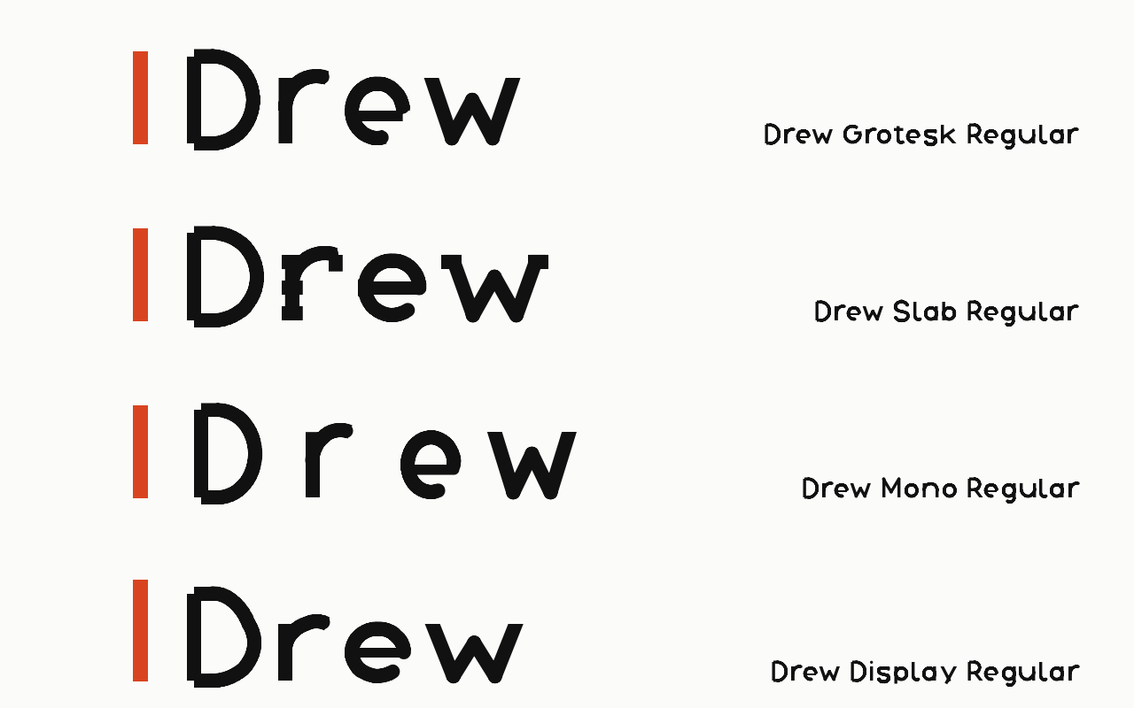
Near it
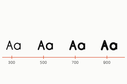 Variable font
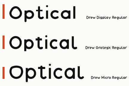 Optical size
What it is made of
| what it is | one design carried across classes - a serif, a sans, a slab - sharing metrics so the three can be swapped in a line without anything moving | |
| measured on this shelf, and the first two versions of this row measured the wrong thing | the 23 families are drawn from ONE skeleton on one grid, box 24, cap [4, 20], baseline 20; fifteen keep its x-height and eight move it structurally (Display, Engrave, Terrace, Press, Poster, Gazette, Compact and Micro). The vertical half of a superfamily is there for the fifteen and deliberately not for the eight | read from the family engine's own settings, 2026-09-24. This row has been wrong twice: first it said 23 distinct metric sets, which was the stroke landing wherever it landed rather than the drawing; then it said all 23 share one grid, read from face.json design blocks that are copied from the base and do not record the eight that move the x-height |
| and on the ink it comes as close as the drawing says | eight families share a cap of 700 and an x of 525 on the ink: Condensed, Grotesk, Mono, Monoline, Outline, Slab, Square and Unicase, and no two of the eight share their widths | measured with fontTools on the fixed shelf, 2026-09-24. Until then the shared pair was cap 757 and x 582, the whole face standing 57 units under its baseline; the baseline fix moved the eight together and they still agree |
| what is genuinely not shared | the advance widths | a superfamily needs the horizontal half too, and no two families here share their A-to-Z advances. That is the real remaining distance and it is much shorter than eight different cap heights made it look. Re-checked on the fixed shelf 2026-09-24: no two of the 23 share their A-to-Z advances |
Where it came from
The idea is usually credited to Adrian Frutiger's system thinking, and the modern examples date from the 1990s onward.
Done well
- Thesis, Luc(as) de Groot, 1994
- Rotis, Otl Aicher, 1988