Flat design
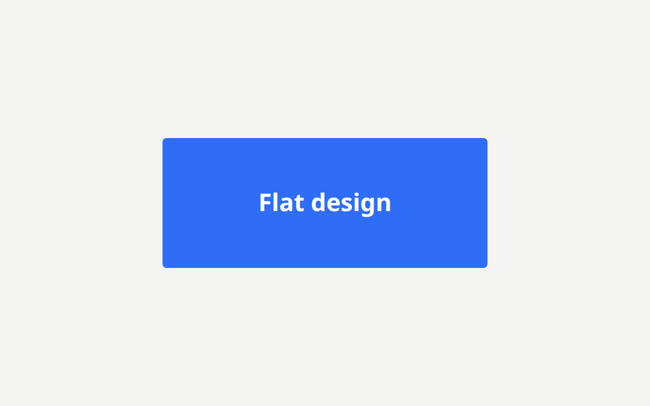
Removing every cue that implies depth, so a surface is a colour and an edge and nothing else.
Near it
 Skeuomorphism
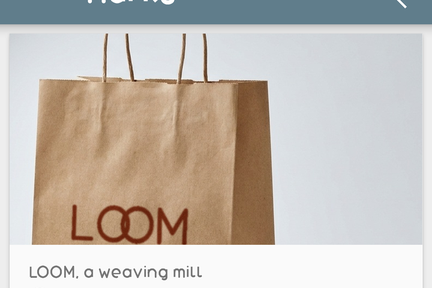 Material Design
 Metro
Metro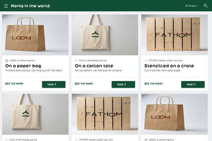 Flat 2.0
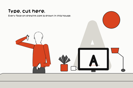 Corporate illustration
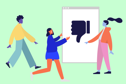 Corporate Memphis
MinimalismLigne claireNeo-brutalismNeumorphism
What it looks like
Flat design
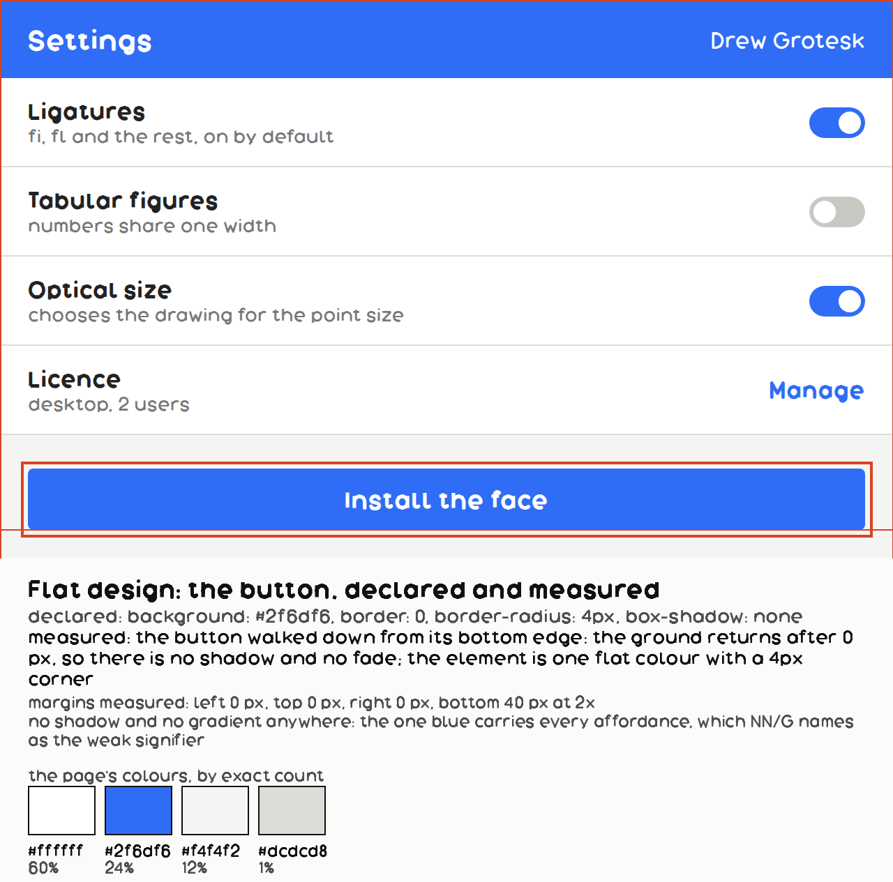
background: #2f6df6;
border: 0;
border-radius: 4px;
box-shadow: none;
color: #ffffff;
What it is made of
| what it is | NN/g: "Flat design is a popular design style that is defined by the absence of glossy or three-dimensional visual effects in the graphical elements of a web page. Many designers consider it to be an offshoot of minimalist web design." | Nielsen Norman Group, "Flat Design: Its Origins, Its Problems, and Why Flat 2.0 Is Better for Users". Read whole, 2,174 words, 2026-09-11 |
| when | NN/g date its emergence to 2011 and its popularity to "around 2012" | Nielsen Norman Group, "Flat Design: Its Origins, Its Problems, and Why Flat 2.0 Is Better for Users". Read whole, 2,174 words, 2026-09-11 |
| the objection | NN/g: "One of the biggest usability issues introduced by flat design is the lack of signifiers on clickable elements", and "long-term exposure to these flat yet clickable elements has been slowly reducing user efficiency by complicating their understanding of what's clickable and what isn't." | Nielsen Norman Group, "Flat Design: Its Origins, Its Problems, and Why Flat 2.0 Is Better for Users". Read whole, 2,174 words, 2026-09-11. They are not a neutral party and the record says so: "Since flat design's emergence in 2011, Nielsen Norman Group has been a vocal critic of its inherent usability issues." That is a stated position from a named source, which is worth more than an unattributed consensus |
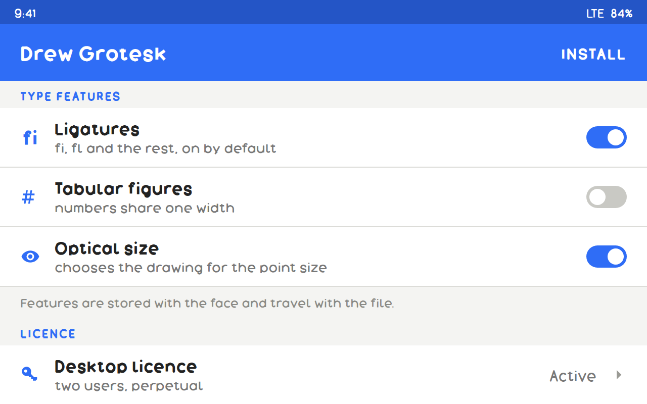
| the three cues a reader uses | NN/g: "Traditional, externally consistent signifiers (such as the blue, underlined text or raised buttons)"; "Something reminiscent of a traditional signifier (such as underlined text of any color or boxed text)"; "Contextual clues (such as actionable text or placement at the top of the page)" | Nielsen Norman Group, "Flat Design: Its Origins, Its Problems, and Why Flat 2.0 Is Better for Users". Read whole, 2,174 words, 2026-09-11. OUR OWN flat-design PICTURE USES THE THIRD ONLY: its actions are set as text in position, with no raised form and nothing reminiscent of one. That is the style drawn honestly rather than flatteringly, and it is exactly the condition the entry beside it is about |
Where it came from
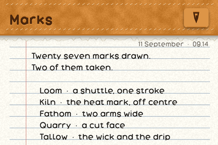
Microsoft's Metro in 2010 is the first mainstream commitment; iOS 7 in 2013 is the moment it became the default. It is best understood as a reaction against skeuomorphism rather than as a position of its own.
Where it fails
Nothing looks pressable. Removing depth removes the main signal that a thing is a control, which is the whole reason the next step existed.