Grotesque
Also called Grotesk, Gothic
The first family of sans serifs: slightly uneven, a little squarish in the curves, with a bowl-and-tail lowercase g and a tendency to close up its apertures.
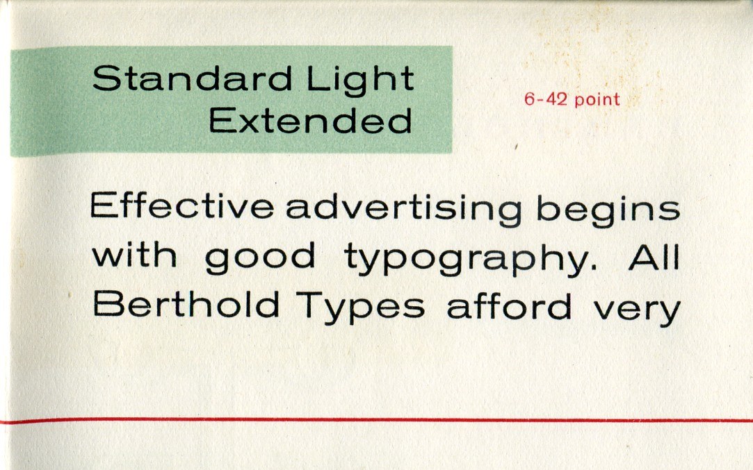
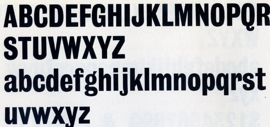
Near it
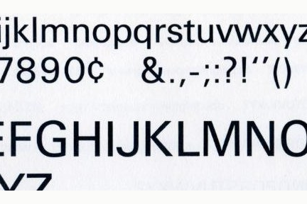 Neo-grotesque
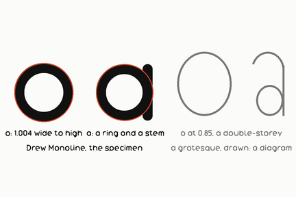 Geometric sans
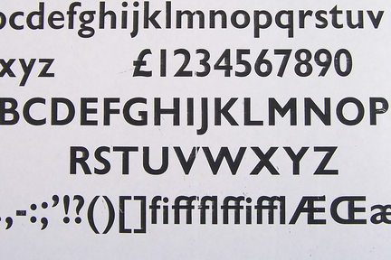 Humanist sans
 Aperture
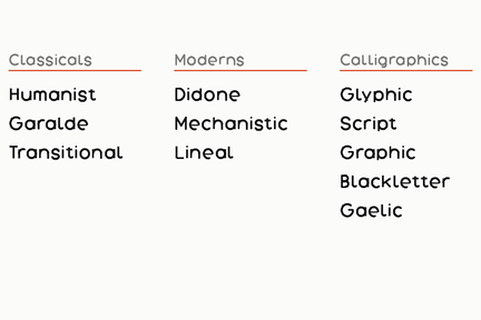 Vox-ATypI
.jpg)
.jpg)
What it is made of
| apertures | closed | the terminals of the c and s curl in toward each other |
| curves | slightly squared | |
| stroke | near-uniform, with the small irregularities that later classes removed |
Where it came from
The name is nineteenth-century British and was not a compliment; a letter with the serifs taken off looked grotesque. American foundries called the same thing gothic. Caslon's Two Lines English Egyptian of 1816 is generally cited as the first printed sans serif.
Done well
- Akzidenz-Grotesk, H. Berthold AG, 1896
- Franklin Gothic, Morris Fuller Benton, 1902
Sources
- Two Lines English Egyptian specimen, William Caslon IV not read