Neo-grotesque
Also called Realist, Transitional sans
The grotesque with its irregularities engineered out: closed apertures, horizontal terminals, and a deliberate refusal to have a voice.
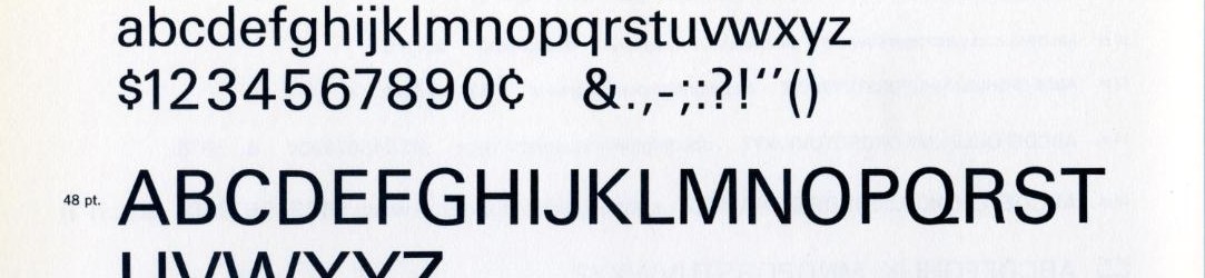
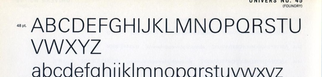
Public domain
Public domain: A rendering of the typeface's letterforms uploaded to Commons as public domain by its maker; typeface designs are not copyrightable in the United States and no font software is included, so the picture of the letters carries no copyright there; this house reads that as the basis and names Monotype as the design's owner.Near it
 Grotesque
 Geometric sans
 Swiss typography
 Aperture
 Humanist sans
.jpg)
.jpg)

What it is made of
| terminals | cut horizontally or vertically, never at an angle | |
| apertures | tight | |
| character | suppressed on purpose | the design goal was neutrality, which is itself a strong position and reads as one |
| VOX DID NOT HAVE THIS CLASS, which is the first thing to know about the term | the system put every sans-serif into ONE class. ATypI: "the Linéales (Lineals) combined all sans-serif types, such as Futura and Gill Sans, into one class." Neither Futura nor Gill Sans is distinguished from the other in it. | ATypI, "ATypI de-adopts Vox-ATypI typeface classification system", published 27 April 2021, read whole (1,136 words). So this term is a LATER SUBDIVISION of a Vox class rather than a Vox class, and a record that presents it as one is repeating a tidier history than the sources support. Maximilien Vox's own 1954 text is NOT HELD AND UNREAD in this house. Everything here comes from the custodian's 2021 statement, which is a primary for the system's history and its withdrawal and is NOT a definition of the individual classes |
| and the parent classification is retired | see above | AND THE CLASSIFICATION THIS TERM BELONGS TO WAS RETIRED BY ITS OWN CUSTODIAN. The ATypI board de-adopted Vox-ATypI on 18 March 2021 and withdrew its endorsement, because the system divides only the Latin writing system and a later revision put Cyrillic, Arabic, Hebrew and the Asian scripts together under one heading called Non-Latines. ATypI, "ATypI de-adopts Vox-ATypI typeface classification system", published 27 April 2021, read whole (1,136 words) |
Where it came from
Switzerland and Germany in 1957, a year that produced Helvetica and Univers within months of each other.
Done well
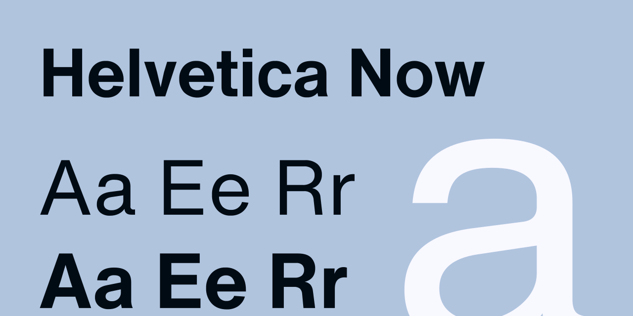
- Neue Haas Grotesk, renamed Helvetica in 1960, Max Miedinger and Eduard Hoffmann, 1957
- Univers, Adrian Frutiger, 1957